A Roots website, with booking, store, and blog pages, a spacious sanctuary for healing and soul transformation.
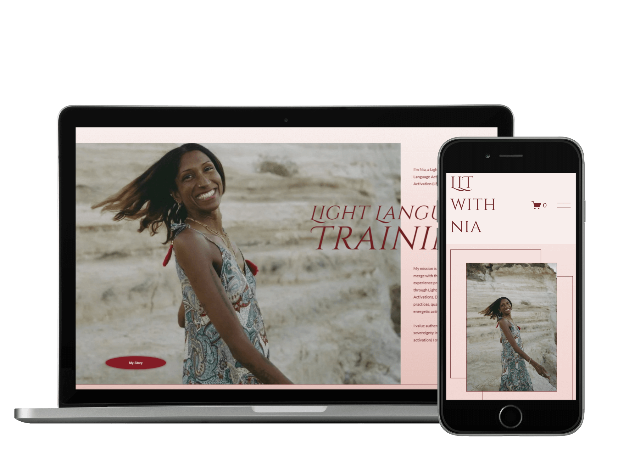
Built for Light Language activator Nia, this Roots website expanded beyond the original brief through bespoke add-ons. The site balances a calm, spacious homepage with extended functionality, creating a grounded yet magical online home for her work.
The Project
Light Language Training was designed as a spacious, ceremonial online home for Nia’s work, with simplicity and energetic integrity at its core. While the site highlights a single primary offering, it needed to hold multiple access points, group and one-to-one training, pay-in-full and deposit options, without feeling busy or transactional.
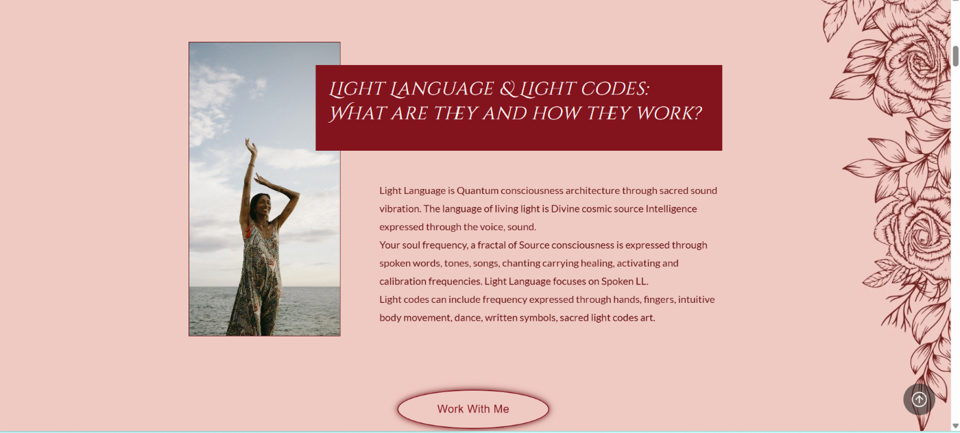
Colour played a central role in the design process. Nia was deeply connected to rose and divine feminine energies and felt strongly drawn to red, but not red as it’s commonly used in commercial or mass-market branding. The palette was carefully refined to soften and deepen those tones, creating a sense of devotion, warmth, and embodiment rather than urgency or sales pressure.
The overall structure was kept intentionally minimal and spacious, allowing the site to feel more like a sanctuary than a storefront. Gentle movement, clear hierarchy, and breathing room throughout the layout support a slower, more intentional experience, one that mirrors the ceremonial nature of Nia’s work and invites visitors to arrive, feel, and choose their next step with ease.
Highlights
This Roots website shows how a spacious, devotional design can hold multiple pathways to work together, without ever feeling busy or transactional.
Key features include:
Storefront-led booking flow, using digital products rather than a traditional booking system, allowing clients to join trainings by paying in full or via deposit
Five integrated products within the store, supporting group and one-to-one training pathways as well as a recorded digital course
Two self-paced courses fully integrated into the website, with access delivered on purchase
Blog pages set up for podcast and YouTube content, ready to support long-term visibility and growth
Minimal, intuitive navigation, keeping the site easy to move through and energetically calm
Devotional, feminine design language, with rose and softened red tones chosen to evoke embodiment rather than urgency